 West Wind Web Toolkit for ASP.NET
 Using the Pager Web Control to Page Content and Data Results
West Wind Web Toolkit for ASP.NET
Using the Pager Web Control to Page Content and Data Results
Using the Pager Web Control to Page Content and Data Results
West Wind Web Toolkit for ASP.NET
Using the Pager Web Control to Page Content and Data Results
Some of the features provided by the control are:
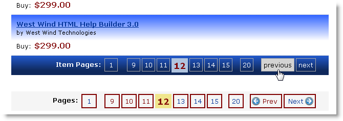
To give you an idea what the pager looks like, here are two differently styled examples (all via CSS):
The markup for these two pagers on the page looks like this:
<ww:Pager runat="server" id="ItemPager"
          PageSize="5"
          PageLinkCssClass="gridpagerbutton"
          SelectedPageCssClass="gridpagerbutton-selected"
          PagesTextCssClass="gridpagertext"
          CssClass="gridpager"
          RenderContainerDiv="true"
          ContainerDivCssClass="gridpagercontainer"
          MaxPagesToDisplay="6"
          PagesText="Item Pages:"
          NextText="next"
          PreviousText="previous"
          />

<ww:Pager runat="server" id="ItemPager2"
          PageSize="5"
          RenderContainerDiv="true"
          MaxPagesToDisplay="6" />
The latter example uses default style settings so it there’s not much to set. The first example on the other hand explicitly assigns custom styles and overrides a few of the formatting options.
The default styling shown for the red outlined pager looks like this:
.pagercontainer
{
    margin: 20px 0;
    background: whitesmoke;
    padding: 5px;
}
.pager
{
    float: right;
    font-size: 10pt;
    text-align: left;
}
.pagerbutton,.pagerbutton-selected,.pagertext
{
    display: block;
    float: left;
    text-align: center;
    border: solid 2px maroon;
    min-width: 18px;
    margin-left: 3px;
    text-decoration: none;
    padding: 4px;
}
.pagerbutton-selected
{
    font-size: 130%;
    font-weight: bold;
    color: maroon;
    border-width: 0px;
    background: khaki;
}
.pagerbutton-first
{
    margin-right: 12px;
}
.pagerbutton-last,.pagerbutton-prev
{
    margin-left: 12px;
}
.pagertext
{
    border: none;
    margin-left: 30px;
    font-weight: bold;
}
.pagerbutton a
{
    text-decoration: none;
}
.pagerbutton:hover
{
    background-color: maroon;
    color: cornsilk;
}
.pagerbutton-prev
{
    background-image: url(images/prev.png);
    background-position: 2px center;
    background-repeat: no-repeat;
    width: 35px;
    padding-left: 20px;
}
.pagerbutton-next
{
    background-image: url(images/next.png);
    background-position: 40px center;
    background-repeat: no-repeat;
    width: 35px;
    padding-right: 20px;
    margin-right: 0px;
}
These styles can be found in westwind.css. There's also a set called .gridpager which corresponds to the first view that is more appropriate for use on table based controls and follows the stock table styling formats.
So for this markup:
<ww:Pager runat="server" id="ItemPagerManual"
          PageSize="5"
          MaxPagesToDisplay="6"
/>
You can use code as simple as:
ItemPagerManual.PageSize = 3;
ItemPagerManual.ActivePage = 4;
ItemPagerManual.TotalItems = 20;
to explicitly render a pager.
Note that ActivePage is not required - it will automatically use any Page=x query string value and assign it, although you can override it as I did above. TotalItems can be any value that you retrieve from a result set or manually assign as I did above.
A more realistic scenario based on a LINQ to SQL IQueryable result is even easier. In this example, I have a UserControl that contains a ListView control that renders IQueryable data. I use a User Control here because there are different views the user can choose from with each view being a different user control. This incidentally also highlights one of the nice features of the pager: Because the pager is independent of the control I can put the pager on the host page instead of into each of the user controls. IOW, there’s only one Pager control, but there are potentially many user controls/listviews that hold the actual display data.
The following code demonstrates how to use the Pager with an IQueryable that loads only the records it displays:
protected void Page_Load(objectsender, EventArgs e)
{
    Category = Request.Params["Category"] ?? string.Empty;

    IQueryable<wws_Item> ItemList = ItemRepository.GetItemsByCategory(Category);

    // Update the page and filter the list down
    ItemList = ItemPager.FilterIQueryable<wws_Item>(ItemList);

    // Render user control with a list view


    Control ulItemList = LoadControl("~/usercontrols/" + App.Configuration.ItemListType + ".ascx");
    ((IInventoryItemListControl)ulItemList).InventoryItemList = ItemList;
    phItemList.Controls.Add(ulItemList);  // placeholder

}
The code uses a business object to retrieve Items by category as an IQueryable which means that the result is only an expression tree that hasn’t execute SQL yet and can be further filtered. I then pass this IQueryable to the FilterIQueryable() helper method of the control which does two main things:
In addition to IQueryable there are also filter methods for FilterIEnumerable<T>() and FilterDataTable(), but these versions just filter the data by removing rows/items from the entire already retrieved data so they are not as efficient in terms of data retrieval.
The very basic plain vanilla ASP.NET grid markup looks like this:
and looks like this when rendered:<div style="width: 600px; margin: 0 auto;padding: 20px; "> <asp:DataGrid runat="server" AutoGenerateColumns="True" ID="gdItems" CssClass="blackborder" style="width: 600px;"> <AlternatingItemStyle CssClass="gridalternate" /> <HeaderStyle CssClass="gridheader" /> </asp:DataGrid> <ww:Pager runat="server" ID="Pager" CssClass="gridpager" ContainerDivCssClass="gridpagercontainer" PageLinkCssClass="gridpagerbutton" SelectedPageCssClass="gridpagerbutton-selected" PageSize="8" RenderContainerDiv="true" MaxPagesToDisplay="6" /> </div>
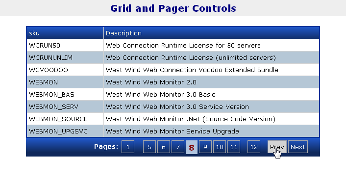
using custom set of CSS styles. The code behind for this code is also very simple:
protected void Page_Load(object sender, EventArgs e)
{
    string category = Request.Params["category"] ?? "";

    busItem itemRep = WebStoreFactory.GetItem();
    var items = itemRep.GetItemsByCategory(category)
                       .Select(itm => new {Sku = itm.Sku, Description = itm.Description});

    // run query into a DataTable for demonstration
    DataTable dt = itemRep.Converter.ToDataTable(items,"TItems");

    // Remove all items not on the current page
    dt = Pager.FilterDataTable(dt,0);

    // bind and display
    gdItems.DataSource = dt;
    gdItems.DataBind();
}
A little contrived since the list could already be bound from the list of elements, but this is to demonstrate that you can also bind against DataTable if your business layer returns those.
Unfortunately there’s no way to filter a DataReader as it’s a one way forward only reader and the reader is required by the DataSource to perform the bindings. However, you can still use a DataReader as long as your business logic filters the data prior to rendering and provides a total item count (most likely as a second query).
<div id="ItemPager" class="pagercontainer">
    <div class="pager">
        <span class="pagertext">Pages: </span><a href="http://localhost/WestWindWebStore/itemlist.aspx?Page=1" class="pagerbutton" />1</a>
        <a href="http://localhost/WestWindWebStore/itemlist.aspx?Page=2" class="pagerbutton" />2</a>
        <a href="http://localhost/WestWindWebStore/itemlist.aspx?Page=3" class="pagerbutton" />3</a>
        <span class="pagerbutton-selected">4</span>
        <a href="http://localhost/WestWindWebStore/itemlist.aspx?Page=5" class="pagerbutton" />5</a>
        <a href="http://localhost/WestWindWebStore/itemlist.aspx?Page=6" class="pagerbutton" />6</a>
        <a href="http://localhost/WestWindWebStore/itemlist.aspx?Page=20" class="pagerbutton pagerbutton-last" />20</a> <a href="http://localhost/WestWindWebStore/itemlist.aspx?Page=3" class="pagerbutton pagerbutton-prev" />Prev</a> <a href="http://localhost/WestWindWebStore/itemlist.aspx?Page=5" class="pagerbutton pagerbutton-next" />Next</a></div>
        <br clear="all" />
    </div>
</div>
The links point back to the current page and simply append a Page= page link into the page. When the page gets reloaded with the new page number the pager automatically detects the page number and automatically assigns the ActivePage property which results in the appropriate page to be displayed. The code shown in the previous section is all that’s needed to handle paging.
Note that HTTP GET based paging is different than the Postback paging ASP.NET uses by default. Postback paging preserves modified page content when clicking on pager buttons, but this control will simply load a new page – no page preservation at this time.
