 West Wind Web Toolkit for ASP.NET
 Creating Modal Dialogs for Client and Server Operation
West Wind Web Toolkit for ASP.NET
Creating Modal Dialogs for Client and Server Operation
Creating Modal Dialogs for Client and Server Operation
West Wind Web Toolkit for ASP.NET
Creating Modal Dialogs for Client and Server Operation
ModalDialog support in the Web Toolkit is provided both via client jQuery Plug-in and a server side server control which is very easy to use both on the client and server. The jQuery plug in allows you to attach to any HTML element and display it ontop of an opaqued background that disables elements. There are many options on how the display can be managed. The server control adds a basic template layout to create a 'dialog' and provides automatic linking to all the support libraries.
Here's what a basic modal dialog looks like:
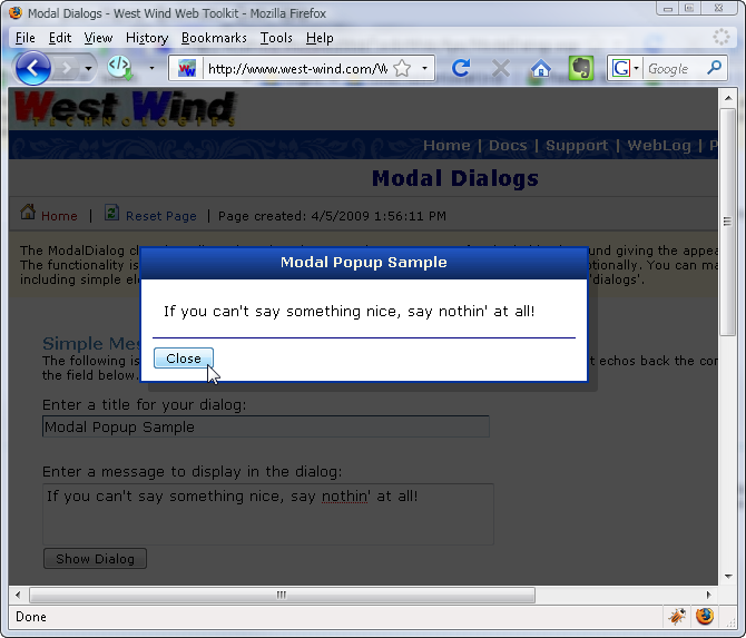
The client component allows making any HTML element the 'dialog' or element that gets popped up in front of the opaque background. Assuming you have laid out a dialog like the one above in a <div> tag with an id it's as easy as:
$("#divDialog1").modalDialog();
to display the dialog. Any click on the dialog anywhere will close it. If you want more control and capture the buttons a client handler has to be applied.
$("#divDialog1")
   .modalDialog( { dialogHandler: function() {
       // this is the element clicked
       if (this.id == "btnOK")
          return true;  // close dialog

       return false; // don't close dialog
   });
The above uses only client code and can be done without any server support. Just include jQuery and ww.jQuery and you're off.
The server control wraps this functionality into a component so rather than using jQuery selectors you get a global variable to the dialog and you can call .show() and .hide() on it. It also provides many properties for the 'dialog' display such as draggable, closable, shadows etc.
Modal dialogs can be styled so you can set up the layout any way you choose, or you can use a generic client side only version that requires no page level setup. The modal dialogs can be optionally draggable and closable as they inherit from wwDragPanel.
You can also customize the background overlay by specifying an HTML element that is used as the overlay - that element can be styled with different a background color or image and even contain custom content before overlaying the background opaquely. The following image demonstrates an overlay with an image background:
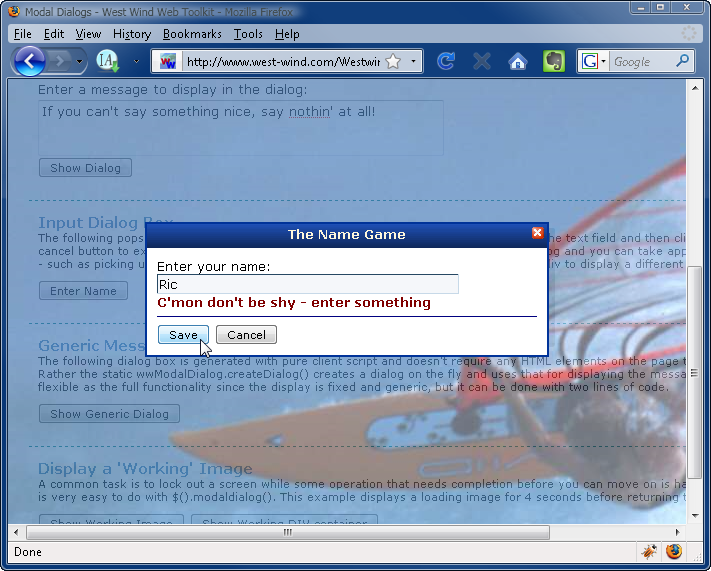
As you can see the content of the panel can contain anything you choose including input controls. You can capture user input and then hook up a ClientDialogHandler function in JavaScript that can capture the input based on clicks in the dialog.
In this example the text control is a client side input box, but you can also add server side controls. Just keep in mind that if you use server side controls that fire events those events will cause a Postback, while the two buttons of the dialog typically fire as client side events which you can capture and check for. This control is primarily intentended for client controlled dialogs, but there's also a server side Show() method that pops up the modal dialog when the page first loads.
Although this control is called a ModalDialog control you can pop up any type of content not just controls. A common scenario for example is to show images pop up ontop of a disabled form to show progress information:
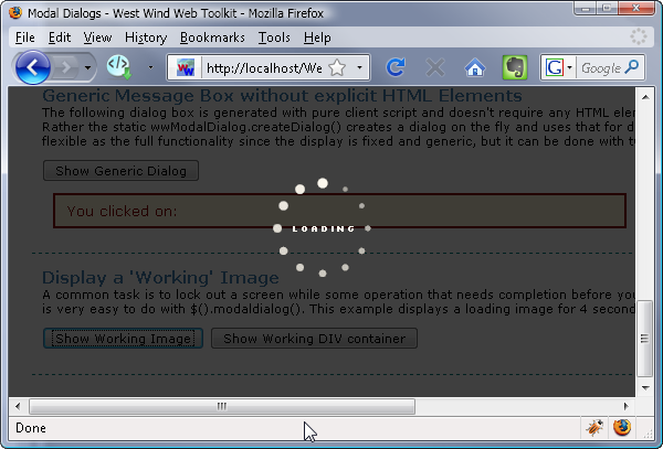
Here client code is used to simply display a previously hidden image stored anywhere on the page.
<img id="imgLoadingBlack" src="../images/loading_black.gif" alt="Loading..." style="display:none"/>
To display as an overlay then is as simple as:
$("#imgLoadingBlack").modalDialog();

// hide it after 4 seconds
setTimeout(function() { $("#" + id).modalDialog("hide"); },4000);
